
How to Choose the Best Paint Colors For Your Home
Home Improvement & DIY, Home, Paint Colors, Home Office, Hot To Decorate
By Deborah von Donop. A Guide To Creating Comfortable, Stylish Living Spaces


How-To Painting Advice: Doing it yourself?
Today I am sharing tips on how to Get Your Paint Colors Right The First Time. Why? Because it is important to take the time and choose correctly to avoid painting the room twice. These are step-by-step tips and advice that professional interior designers use to ensure the best selection the first time around for your project.
Interior design, styling, and selection of paint colors — are the biggest quires an interior design will answer most often.
Today we’re breaking down some of the most popular paint colors by Benjamin Moore. If you are using Farrow & Ball paints, make sure to check out our post here: “Top Farrow & Ball Paint Colors” — everyone’s frustrated when trying to find the perfect solution.
So what’s the difference between Benjamin Moore and Farrow & Ball? For me it’s what I teach in my decorating lessons, it’s knowing the number of pigments used which renders a deeper, sometimes more delightful color, and the price per gallon. I put in many years fine-tuning my color eye and developing my preferences.
Take a look and make your next project a success.
If you are looking for paint colors for your kitchen, then check out my post: No-Fail Paint Colors for Your Kitchen + free Download )
White is complicated: If you are thinking you only want white colors in your rooms, check out my Top 6 Favorite White Colors and How To Choose The One That Will Work For You.
Looking for color suggestions to get you started? See the bottom of this post for a downloadable color sheet of the top Benjamin Moore Colors this year!


The Power of Paint

Did you ever consider how color sets the mood of a room?
Paint can definitely breathe new life into any room, refresh a thrift market find, and make any item more stylish with the right color, so make sure to take your time to select properly by applying a few simple processes.
I’m going to give you the 7 tips for selecting the right color.
When selecting the color for a room, consider a dark color as embracing for intimacy, and a light color for a large open, and airy room. The color you choose is a feeling - warm and inviting or cool and relaxing. Color offers many psychological influences on our feelings, concentration, and more.
Paint can be complicated. Please please, take your time, and make sure you have selected the right color for your room before you paint.
What you see in a magazine or on Pinterest are images that have been adjusted by filters. What looks great in the picture does not always look good in your home. this is why we suggest testing.
*It’s worth keeping in mind that an interior paint job that has been properly applied generally lasts between 7 to 10 years. That’s good to know, but who says you can’t change colors sooner?
Painting a room might just be the Refresh you need.
7 Super Helpful Tips and Advice to Choosing The Interior Paint Colors
1. Interior Design RULE #1
Your paint color should be the last thing you choose when putting a room together! Yup…
I have my friends and even some past clients call and always ask me, “what color should I paint my room?”. Well, that depends on what items of furniture, artwork and flooring have been selected!
I tell friends and clients, your Paint Color is the LAST thing you should select in the room! - Deborah von Donop - dvd Interior Design
The designer's best practices are to pick your paint color last!
Sometimes I'll get questions asking how I found a particular carpet that matched my room perfectly? Well, I picked the carpet first! Then I choose paint colors. Sometimes we may start with the artwork, sometimes the carpet but we do not start with paint colors. You see, paint can be custom colored to match the main items in your room. Choose a coordinating color for a flawless makeover.
2. Assess and Know Your Lighting
Both natural and artificial lighting is crucial to choosing your color.
When it comes to natural lighting, knowing your orientation - the direction that your room faces, whether it’s north, south, east, or west - and how many windows you have is a major consideration. Next is your light fixtures, their placement, and the type of bulbs you've selected for your lighting! Not so easy right? There are a lot of components at play that will affect your color choices and how they will work in any given room. All these elements will all have an impact on how your color will look on your walls.
Select your color last. Place options in the room and live with them for 4 days to see the changes that occur in the color as the sun varies during the day.
If your home or room is under construction, and it is not possible to sample colors with all elements in the room, then place as many samples that you may have, like drapery, carpet, art, upholstery, all together in the shade of natural light and select the paint color in context with the primary items that will be in the room.
3. Still Struggling On Selecting Colors that You Like?
Select Your Colors Based On The Focal Point of the Room
If you are not sure about which carpet or artwork will drive the design of your room, then I suggest that you look closely at your own wardrobe for inspiration and to find colors that you favor.
First, decide what is the focal point of your room? For example, if you are working on your bedroom, your focal point is your bed and the wall behind it. Until you select a headboard, your bedding, side tables, and carpet, then you cannot pick a paint color yet. Think about the components of the room and how they will complement your color choice. You may have a large artwork that serves as a focal point of the room - could you use a color featured (or even just a little hint or pop of color) in the painting for inspiration? Your existing furniture and cabinetry will have an impact as well.
Design Tip
When selecting colors from paint chips, pick a few favorites, then choose one shade lighter and one darker as well. This will help take into consideration the effect lighting has.

4. Paint Samples Are Your Friend
Get paint chips and sample pots to test your color selections - this step is really important! the key to achieving success is testing the colors in person before making the final purchase. I always encourage homeowners to be sure and sample before committing. Testing is an imperative part of the process.
It’s not enough to tape up the small paint chips on the wall. for your final decision you really need to paint a minimum 3-foot square in the space. Look at it in different times during the day.
Also, colors will look brighter on the walls than they do on a tiny chip (because of the scale of color on a large wall). You should plan about 4 days to live with the 3” x 3” painted sample squares, to see how you feel about the color as it changes throughout the day. The way a color looks in the morning will be totally different from how it looks in the evening light, and at nighttime with incandescent and LED lighting.
Design Tip
Don’t want the mess of paintbrushes and painting the walls? Try SAMPLIZE, a great mail-order paint sample so you can try your color on the wall with peel and stick paint samples. Super fun, and is mailed to you right away- dvd Interior DesignAre you considering a kitchen remodel? For more tips and some moral support as you undertake a kitchen remodeling project, check out the “Kitchen Remodel Project Guide”.

5. Color Is Luxury. Consider the uses of the room and how you want the color to influence your mood there
Color is one of the easiest decorating projects you can undertake. since paint is accessible to everyone. Getting it right isn’t a secret, it's the simple idea of being open to color, and using these strategies to select the right color for you.
A Room for Color? My choice for a strong impact in color is to consider it for rooms that you don’t spend much time in. Sucha s powder rooms, and entrance halls. these are perfect areas to add drama and impact.
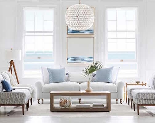
Living Room: is your biggest investment, so you’ll want to choose a color that will last and offer the style and works well with all the appliances, fixtures, and cabinetry in the room. I like to suggest strong deep blues, or classic greys and whites. See our
A kitchen color choice- Your kitchen is your biggest investment, so you’ll want to choose a color that will last and offer the style and works well with all the appliances, fixtures, and cabinetry in the room. I like to suggest strong deep blues, or classic greys and whites. See our post “No-Fail Kitchen Paint Colors YOu're Going to Love” if you are looking for color choices for your kitchen.
A bedroom color choice - think about how you want to feel in the room. A bedroom could be soothing, intimate, restful - this would be different to a kitchen - Light soothing colors or dark colors can work for you depending on your preference. Light can also play a big role in your color. southern exposure versus low light levels to the north and change your desire for a certain color. Psychology of colors. Blues - Greens are considered calming, with blush and pinks colors of romance. A dark color scheme can create a sense of intimacy create
Home office color choice? See my post on home office colors designer use again and again: “Home Office Paint Colors You’ll Love” and a free Color Guide download to take to the paint store. If you are looking to use dark blue or black, then the home office is your place to get creative and bold with your colors.
Every year, paint manufactures announce a color of the year, and a full palette to coordinate. See my post here: “ Benjamin Moore Color of the Year, and How to Use It”
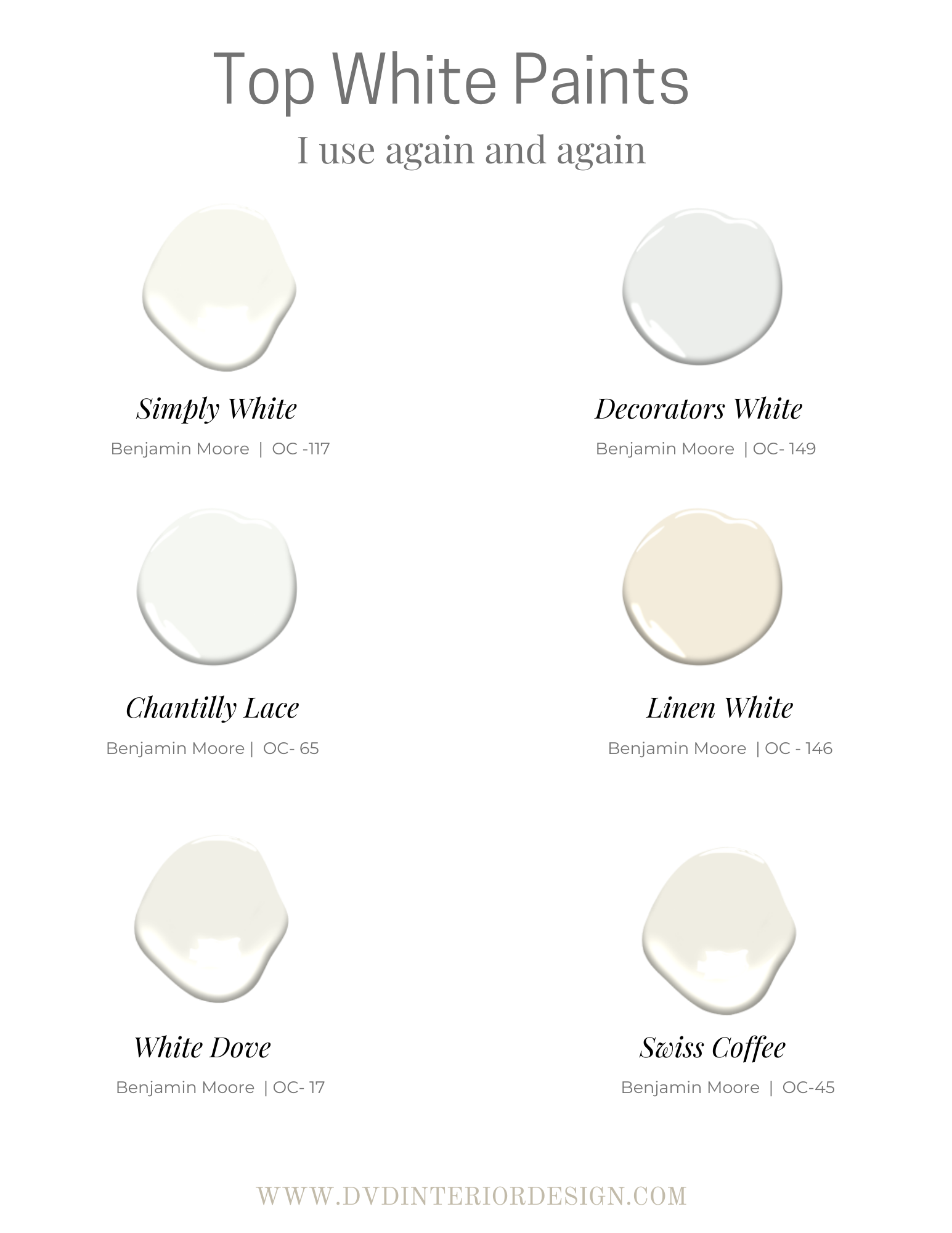
6. Which White Is The Right White?
Everyone loves a white airy room, the perfect backdrop to dark woods, and the best qualities to bring out the daylight. For those of us in the northern hemisphere, (and for those of you in the lower southern hemisphere, like New Zealand) we are always wanting to capture the glow of daylight during the darker winter months when the days are shorter.
While white might feel like a safe choice, selecting the right white is important, and can be difficult given all the choices in white offered in the market.
Not all whites are created equally. Whites have many variations. A white can be warm or cool in the color spectrum, and they can either finish a room or feel out of sync. Which one is the right one?
Ex: Benjamin Moore Whites: Cool, Neutral, Warm

Chantilly Lace - 2120-71
Cool: CHANTILLY WHITE. Cool whites have undertones of blue, green, and gray, creating a space that looks crisp, clean and luminous.

Simply White - OC 117
Neutral: SIMPLY WHITE. This is a wonderful neutral white. It's not too stark and plays nicely with many colors. Given its versatility with many natural finishes, this is my go-to white.

Linen White -OC 146
Warm: LINEN WHITE. This is a great color for a room with antiques. It has a warm finish with some yellow. You may want to marry it with Decorators White on the trim and ceiling. Warm whites have undertones of red and yellow, resulting in a soft glow and welcoming mood.
Are you considering White for your wall and trim colors? For more tips and some moral support as you undertake a new paint project using whites, check out “ My Top 6 favorite White Paints and How To Choose Your White “.
7. Rules on Choosing a Paint Finish
When selecting a finish, know that the terms used indicate the reflection of light.
Flat: Opaque and sophisticated, best used in low traffic areas as it’s not as washable as the shinier finishes.
Matte: Usually used on ceilings and sometimes I use this in dining rooms. (Maybe with a little glitter!) This can also be used in a bedroom for a softer look.
Eggshell: I like this for the walls, it has a low luster, and is easier to clean than flat.
Satin: Most commonly used on cabinets.
To see our favorite colors for kitchen cabinets visit my post “No-Fail Kitchen Cabinet Colors for Your Kitchen”
Semi-gloss: Most commonly used on doors.
High gloss: Looks best on architectural trim work, windows, baseboards, and door trims. It is an art to paint in high gloss, so consider a professional when using this sheen, or practice your technique before starting.
The rule for sheen is “the higher the traffic, the higher the sheen, and feasibility to clean. So if you have a corridor you can use and
xoxo,
Deborah - dvd
Please check out the newly updated BEST SALES for Home Decor: Great bargains for every month!
Related Articles


Download the Color Coordinates here!

*This post contains affiliate links. This means if you click a link and purchase something, I may receive a small commission from the vendor at no cost to you. I only share things that I love and hope you will too!
PIN IT!
Use Pinterest to save your favorite tips and ideas and be sure to follow dvdInteriorDesign’s board here.

How To Choose Paint Colors For Your Home